Over the past decade, the rule on mixing metals has changed. In the mid 2000’s the rule was “Do Not” Mix Metal Finishes! Funny how things change in a decade… Now we are seeing the mixing of metals more than ever in 2016! However, below are some important guidelines to follow in order to ensure your space is a design success.
Rule #1: DO NOT: Clutter! If you make the mistake of trying to put every metal accessory you like in one space, the result will be clutter and a disjointed appearance. In the photos below, the walls in both images lose balance and can stress the viewer out! This is because it is unclear what you are supposed to look at when there are too many pieces and finishes along one wall.

Instead: DO: Use metals to accentuate your focal point. Unlike the former, this example space successfully makes the gold and chrome framed art work the focal. This space is a great example of mixing metals. If you look closely at the focal art work- one of the pairs is gold while the other is silver. The space feels cohesive and put together because the metal finishes are balanced throughout the space. The chrome finishes are grounded and utilized, as shown by the coffee table legs and floor vase. Also, the gold piece that sits on top of the table re-incorporates the table accents and metal wall décor. This finish creates the balance that was missing in the prior example.

Rule #2: DO NOT: Allow your walls to camouflage the metals. In the example below, the wallpaper would be great if simply one chrome wall accessory and one or two table accessory had been chosen. However, this combination of metals, along with the colors chosen for the finishes, create a poor monochromatic décor combo! It is too much for your eyes to take in, and the pieces camouflage into the space. The viewer is only left behind with an uncomfortable feeling as there is little relief (even the lamp shades are stripe!).

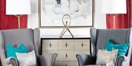
Instead: DO : Allow the metals to stand out through pattern and texture. In the example above, your eye seamlessly moves along the space to see the beauty in each piece of wall décor – nothing is hiding here! Unlike the prior space, the console and the mirror along the wall are a success. This space works well because the metals are a simple yet bold pattern, with a texture your eye is pleasantly drawn to!

Rule #3: DO NOT : Be too Gaudy with your finishes. Gold trim, gold wall décor, gold pattern in the wall paper.. And then the silver & black? It’s TOO MUCH! This is a great example of where less is more!

Instead: DO: Be simplistic with your finishes. This photo is the exact inverse of the former! Here we see a patterned wallpapered space, that is well designed with a variety of metal finishes. The silver and warm gold table décor pairs great with the light fixture. Then the black wall mirror lifts the space up by becoming the focal on the busy paper, helping calm the busy paper down and makes the space feel more refined.

Related Posts